jquery에서 bootstrap 모달 창을 드래그하는 방법은 굉장히 직관적이고 쉽다.
반면에 리액트 부트스트랩 콤포넌트 라이브러리를 사용하면서 react bootstrap modal draggable 하기는 쉽지 않다.
아니, 쉽다.
쉬운데 레퍼런스가 부족하다.
react bootstrap, react-draggable만을 사용해서 정통으로 리액트 부트스트랩의 모달을 드래그하는 것을 웬만하면 포기하고 antd, dragm 조합으로 넘어가는 사람들이 많은 듯하다.
구글에서 react Bootstrap modal draggable주제로 검색하면, 대부분 리액트 예제를 클래스형으로 설명해두고 있다.

how to make react-bootstrap modal draggable
I’ve tried making this to work, but this is what happened. Using react-draggable npm package, I was able to make contents draggable and droppable. But the back of whole dialog stays in place, and it
stackoverflow.com
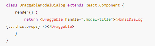
import { Modal } from 'react-bootstrap'import ModalDialog from 'react-bootstrap/lib/ModalDialog'import Draggable from 'react-draggable'class DraggableModalDialog extends React.Component { render() { return <Draggable handle=".modal-title"><ModalDialog {...this.props} /></Draggable> }}// enforceForce=false causes recursion exception otherwise....export default ({titleIconClass, modalClass, children, title,...props}) =><Modal dialogComponent={DraggableModalDialog} show={true} enforceFocus={false} backdrop="static" {...props}> <Modal.Header closeButton> <Modal.Title> {title} </Modal.Title> </Modal.Header> <Modal.Body> {children} </Modal.Body></Modal>react function class 차이를 이해한다면, 간단하게 함수형 리액트 문법으로 수정할 수 있다.
arrow function를 사용해도 상관없다.
흔히들 어려워하는 부분은 바로 props다.
<ModalDialog {…this.props} />
이건 뭐 지극히 간단하다.
얘의 속성들을 다 전달해라.
이런 뜻이니까 말이다.
시작하기 전에 컴포넌트 라이브러리를 설치하는 것은 기본이다.
yarn add react-draggable
해서 리액트 드래그블은 설치하자.
클래스형 함수에서 위와 같이 된 부분은 간단하게 아래와 같이 함수형으로 변환해서 적용하면 된다.
const DraggableModalDialog = ({ ...props }) => { return ( <Draggable handle=".handle"> <ModalDialog {...props} /> </Draggable> ); }; return ( <Modal size="xl" show={show} centered onHide={handleHide} dialogAs={DraggableModalDialog} > <Modal.Header className="handle" closeButton> <Modal.Title>타이틀</Modal.Title> </Modal.Header> <Modal.Body> 바디 내용 </Modal.Body> <Modal.Footer> </Modal.Footer> </Modal> );
모달 헤더에 커서가 놓이면 드래그해서 창을 움직일 수 있다는 암시를 줘야 하므로, scss에서 다음과 같이 스타일을 정해준다.
// drag.modal-header { &.handle { cursor: move; }}